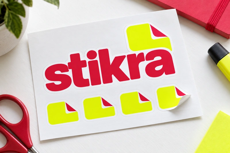
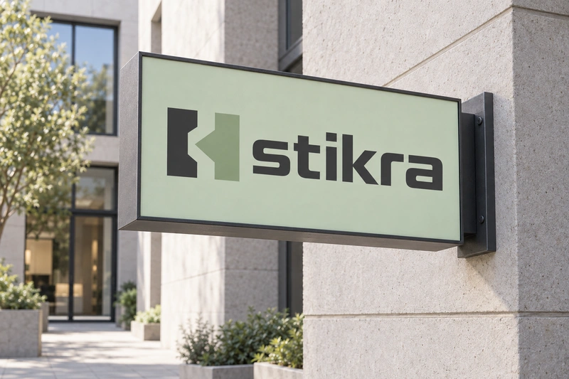
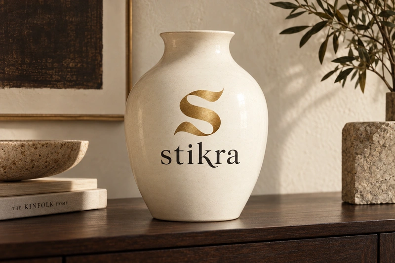
Stikra brings a clipped, tactile quality to a business identity. Its compact shape and firm consonants suggest something made, fitted or handled, while the final vowel adds a little warmth. The resemblance to "stick" offers a possible route into attachment and personal expression, particularly for customization services and design-led consumer goods.
The name could also suit a fabrication studio, an interiors label or a business that connects complex systems. Those applications draw on different qualities: material character, measured construction and the idea of parts working together. Stikra does not explain any of these categories on its own, so a clear descriptor would matter. Buyers should also weigh the possibility of spelling corrections and decide whether the informal association with stickers supports their intended positioning.
Name analysis
An English-speaking reader is likely to try "STIK-ruh" or "STIK-rah," usually with stress on the first syllable. The familiar st opening helps, but the transition from k to r makes the middle more compressed than the six-letter length might suggest. The i could also receive a longer vowel sound from some readers. Visually, the name combines a curved s, upright t and i, angular k, and a softer ra ending. That contrast gives it a useful balance of precision and approachability. Its resemblance to "stick" is a plausible English association, not an established derivation. Any meanings or unintended associations in other languages would need separate checking.
Assessment summary
Stikra is a compact, characterful name with credible applications in customization, fabrication and design-led goods. Its strongest assets are its economy and distinctive letter structure. Less certain spelling from speech, a slightly compressed consonant sequence and limited category information are practical drawbacks.